Automated Content Analysis: Stop Publishing Blind
Most content teams publish without seeing. They have traffic numbers. They have rankings. But they don’t have sight into what’s actually working, why it works, or what to do next. That’s the gap automated content analysis fills.
The problem isn’t the data. It’s the volume. A SaaS company with 600 blog posts has too much information to process manually. A pricing page with 22,000 monthly visitors generates session recordings, scroll patterns, and conversion data that no human can synthesize in a reasonable timeframe. The insights are buried in the noise.
This is where automated content analysis changes the equation. Not as a replacement for thinking. As a tool that surfaces patterns humans would miss, and does it fast enough to act on.
Key Takeaways
- Automated content analysis reveals what’s actually driving traffic and conversions—often contradicting assumptions teams have held for months
- Most content teams publish at high volume without auditing existing performance, creating cannibalization and wasted effort
- The highest-impact insights often come from analyzing intent-to-conversion relationships, not just traffic volume
- Real-time analysis of user behavior (session data, plan selection, visitor paths) uncovers problems A/B testing alone will miss
- Teams that shift from volume-based publishing to performance-based optimization see 40%+ traffic gains and doubled pipeline contribution
The Real Problem: You’re Publishing Blind
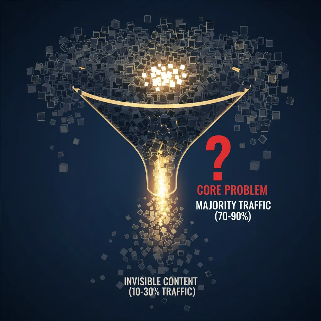
Here’s what happens in practice. A content team publishes four posts a week. They track rankings. They watch organic traffic. But they never ask the hard questions: Which of our 600 posts drive 74% of all traffic? Are we cannibalizing our own rankings? Why does educational content get clicks but never converts?
A SaaS company spent four years publishing consistently. Traffic plateaued. The content director didn’t have a staffing problem or a strategy problem. They had a visibility problem.
When they finally analyzed their full inventory—Google Search Console data, analytics, keyword tracking, publish dates, topics—the picture was brutal. Of 600 posts, 31 drove three-quarters of all organic traffic. Another 240 had never received more than 50 visits. The team had been publishing new content at the same rate without ever auditing what existed.
But that wasn’t the worst part. Automated analysis revealed 23 clusters where multiple posts competed for the same keywords. In several cases, their own articles were pushing each other off page one. One cluster of seven posts about the same feature comparison was splitting authority so badly that a competitor’s single comprehensive post outranked all of them.
This is what happens when you optimize for output instead of outcome.
What Automated Content Analysis Actually Reveals
When you feed content performance data into systematic analysis—whether that’s AI agents, dashboards, or structured review—three patterns emerge that manual review almost always misses.
Pattern 1: Cannibalization and Internal Competition
Your content is competing against itself. You don’t see it because you’re not looking at keyword-to-post mappings across your entire inventory. Automated analysis identifies clusters of posts targeting the same search intent, then shows you the authority leak.
The fix is consolidation. Merge the weak posts into the strong ones. Redirect the traffic. Watch your average ranking improve because you’ve stopped fragmenting your own authority.
Pattern 2: Intent-to-Conversion Mismatch
This is where most teams make their biggest mistake. They optimize for traffic volume, not revenue. They publish educational, top-of-funnel content because it’s easier to write and ranks faster. But it doesn’t convert.
When the SaaS company analyzed their conversion patterns, they found the sharpest insight: posts targeting bottom-of-funnel search intent converted at 14 times the rate of top-of-funnel educational content. Yet 85% of their new content production was top-of-funnel.
Their editorial calendar was optimized for the wrong metric.
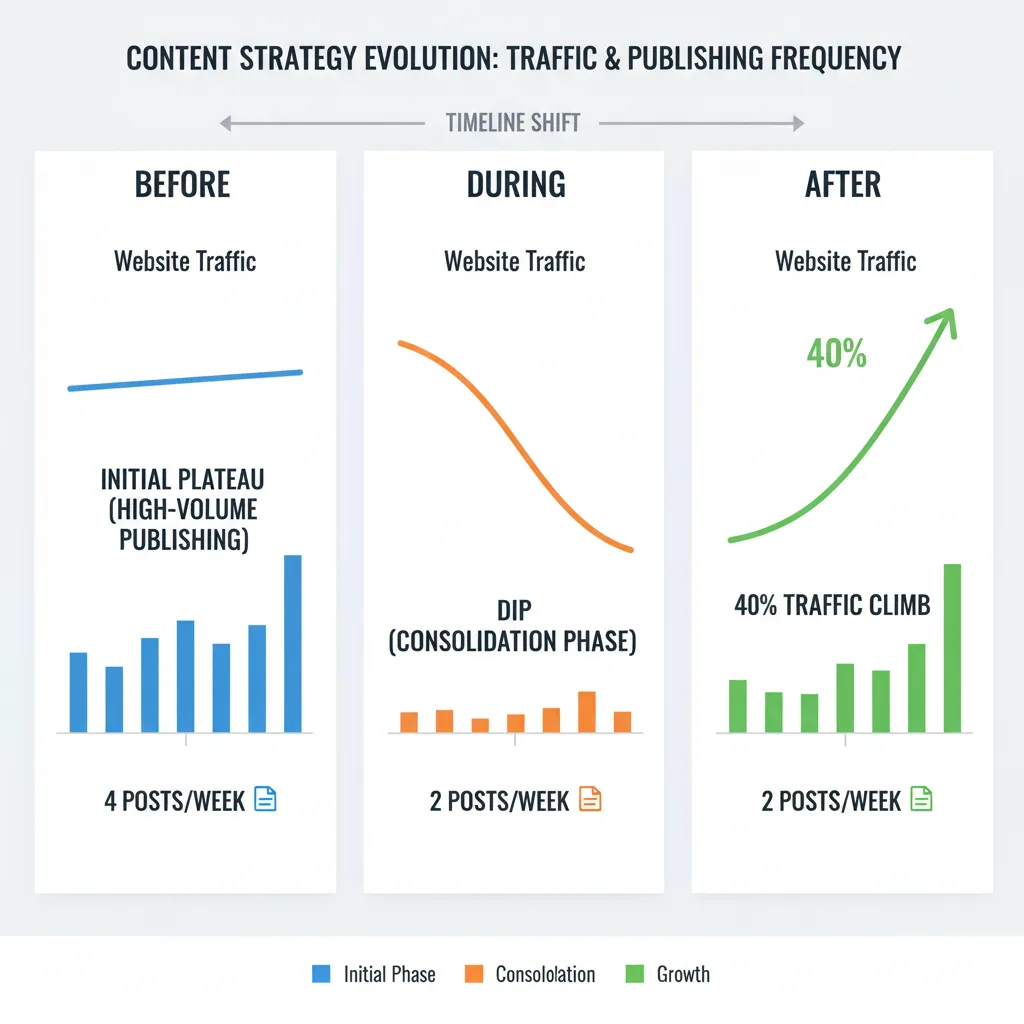
They stopped publishing new content for six weeks. Consolidated the cannibalization clusters. Updated and expanded the 31 high-performing posts. Redirected the dead weight. Then shifted their editorial calendar to 60% bottom-of-funnel intent.
Organic traffic dipped 5% during the pause. Then climbed 40% over the next three months. Organic pipeline contribution doubled. The content team went from four posts a week to two. The CFO stopped asking about budget cuts.
Pattern 3: User Behavior Signals That A/B Testing Misses
Session recordings, scroll depth, plan selection patterns, visitor paths—this data tells you why people don’t convert. A/B testing tells you that button color matters. Behavioral analysis tells you that users are confused about which plan to buy, or that they’re arriving from the wrong source, or that they’re losing confidence halfway through.
A SaaS pricing page got 22,000 visits a month. Conversion rate was 2.1%. The team had A/B tested button colors, headline copy, plan names. Marginal gains. Fourteen months of testing with nothing to show for it.
They pulled session recordings metadata, scroll depth data, plan selection patterns, and post-signup behavior. Three agents analyzed the data in an afternoon.
One agent found that 44% of trial signups picked the wrong plan for their use case and either churned or downgraded within two weeks. Another discovered that visitors arriving from the API docs page converted at 5 times the rate, but the pricing page didn’t speak to developers at all. The third found that visitors who toggled between monthly and annual pricing more than twice almost never converted. They weren’t comparison shopping. They were doing internal budget math and losing confidence.
The team added a three-question recommendation flow before showing plans. Built a developer-specific pricing view triggered by referral source. Replaced the monthly/annual toggle with a savings calculator.
Conversion went from 2.1% to 4.8%. A 128% improvement. Not from testing. From understanding.
How Automated Content Analysis Works in Practice
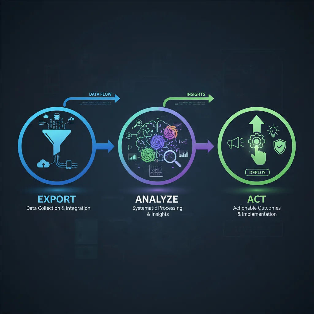
The process has three steps. Export. Analyze. Act.
Export: Pull everything. Google Search Console data, analytics, your full content inventory with publish dates and topics, keyword tracking data. If you’re analyzing user behavior, pull session recordings metadata, scroll depth, plan selection patterns, post-signup usage. The more data you feed into the analysis, the more patterns emerge.
Analyze: This is where automation saves time. Instead of manually reviewing 600 posts, you use systematic analysis to surface patterns. One analysis might map traffic and ranking patterns across your full inventory. Another might identify content cannibalization. A third might model the relationship between content topics, search intent alignment, and conversion events.
For pricing pages or conversion-focused content, the analysis looks different. One agent analyzes where visitors stall and abandon. Another maps which plan visitors selected versus which plan they actually needed based on usage after signup. A third models the path visitors took before reaching the page and how that path affects behavior.
Act: The insights are only valuable if you use them. Consolidate cannibalization clusters. Update and expand high-performers. Shift your editorial calendar. Build recommendation flows. Add developer-specific views. The action depends on what the analysis revealed.
Real Results: When Automated Content Analysis Works
The pattern across teams that implement this is consistent. They see 40% traffic gains. Doubled pipeline contribution. Conversion rates that jump 128%. But the gains don’t come from publishing more. They come from publishing smarter.
One team doubled their organic traffic by rebuilding their AI content strategy. Not by publishing twice as much. By analyzing what was working and what wasn’t, then optimizing based on data instead of assumptions.
Another team increased their ROAS by 40% in the first month by finally being able to see what was actually working. Before, they were pulling reports manually every week, making decisions on stale data. After, they had real-time visibility into performance by audience segment, device, geography, and age group. They spotted that the 25-34 age group was outperforming everything else and shifted 60% of budget there. Noticed mobile was driving 80% of conversions and optimized all creatives for mobile-first. Another 25% boost.
The pattern is the same across all these cases: visibility leads to optimization, optimization leads to results.
The Tools and Methods That Actually Work
You don’t need sophisticated software to start. You need a process.
Some teams use AI agent swarms—systems that analyze different dimensions of your content performance in parallel. One agent looks at traffic patterns. Another at cannibalization. A third at intent-conversion relationships. They work independently, then you synthesize the findings.
Some teams build custom dashboards that pull data from multiple sources—your analytics, your ads manager, your CRM—and present it in one place. Real-time visibility into what’s working. Predictive alerts when performance drops. Audience intelligence that tells you exactly where to focus budget.
Some teams use segmentation analysis. Instead of looking at averages, you look at clusters of users with specific behaviors. This uncovers second-order implications and critical correlations that broad summaries miss. It’s the kind of analysis that used to require a full team of data scientists for three months. Now a single person can do it in a few hours using the right tools.
The common thread isn’t the tool. It’s the discipline. You export your data. You analyze it systematically. You act on what you learn. You don’t rely on gut feeling or assumptions. You let the data tell you what’s working.
For teams publishing regularly and trying to improve content performance, this is where tools like TeamGrain come in. The platform is built to help content teams analyze what’s working across their full inventory, identify optimization opportunities, and distribute high-performing content across multiple channels automatically. Instead of manually reviewing 600 posts or spending weeks on content audits, you can feed your performance data into the system and get actionable insights in hours. Then publish and amplify the winners across 12+ social networks without the manual distribution work.
Common Mistakes Teams Make
Most teams optimize for the wrong metric. They want more traffic, so they publish more content. But more content doesn’t always mean more revenue. Bottom-of-funnel content that converts at 14 times the rate of top-of-funnel content gets less production attention because it’s harder to write and ranks slower. The metric that matters—conversion, pipeline, revenue—gets ignored in favor of the metric that’s easy to measure—traffic volume.
Most teams don’t audit what they already have. They publish at high volume without ever asking which of their existing posts drive the most traffic, which ones are cannibalizing each other, which ones are dead weight. This is why a company can have 600 posts and still see traffic plateau. They’re not publishing too little. They’re publishing without sight.
Most teams don’t look at user behavior. They A/B test button colors and headline copy. But the real problems—confusion about which plan to buy, arriving from the wrong source, losing confidence during the decision process—are invisible to A/B testing. They’re visible to behavioral analysis.
Most teams don’t act on what they learn. They get the analysis. They nod. Then they go back to publishing four posts a week the same way they always have. The insights are only valuable if you use them.
What to Do Next
Start with your own data. Export your Google Search Console data, analytics, and full content inventory. If you’re analyzing a conversion-focused page, pull session recordings metadata and post-signup behavior.
Ask three questions: Which content drives the most traffic? Which content converts the most? Where are we cannibalizing our own rankings?
You don’t need sophisticated analysis to answer these. A spreadsheet and some manual sorting will get you 80% of the way there. But if you have more than 100 pieces of content, manual review becomes impractical. This is where systematic analysis saves time.
Once you’ve identified what’s working, consolidate what’s not. Update and expand the high-performers. Redirect the dead weight. Shift your editorial calendar to focus on the intent that converts.
Expect a short-term dip in traffic while you’re consolidating. Then expect a 40% climb over the next three months as your authority consolidates and your content becomes more conversion-focused.
FAQ
How long does automated content analysis take?
The analysis itself can take hours to a full day, depending on the volume of data and the complexity of the questions you’re asking. But the insights compound over time. The first analysis might take a day. The second takes half that because you’ve already set up the process. By month three, you’re making data-driven decisions automatically.
Do I need a data scientist to do this?
Not anymore. Tools and AI systems have democratized this work. A single person with access to the right tools can do in hours what used to require a full team for months. But you do need discipline. You need to export the data. You need to ask the right questions. You need to act on what you learn.
What if my content is performing well already?
Even high-performing content has optimization opportunities. You might be cannibalizing your own rankings. You might be publishing too much top-of-funnel content and not enough bottom-of-funnel. You might be missing audience segments that convert at much higher rates. Automated analysis reveals these opportunities.
Can this work for pricing pages, landing pages, or just blog content?
It works for any content where you have performance data and user behavior signals. Pricing pages. Landing pages. Blog posts. Email sequences. The principle is the same: export the data, analyze systematically, act on what you learn.
What’s the ROI on doing this?
Teams that implement automated content analysis see 40% traffic gains, doubled pipeline contribution, and conversion rate improvements of 100%+. A content team that goes from four posts a week to two and sees traffic climb 40% has freed up 50% of their time and doubled their output per hour. That’s a significant ROI.